
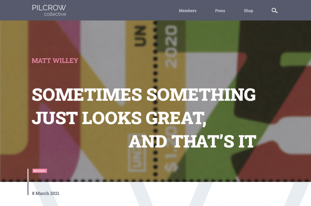
EXPERIENCE DESIGN
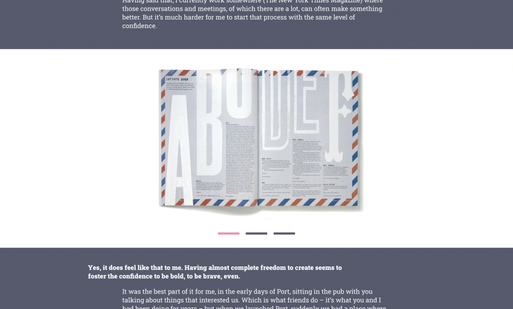
A web design for a hypothetical design collective Pilcrow, implemented for desktop and mobile. The desktop version utilises a 12 column grid and is made up of a simple colour palette of navy blue and white for easy legibility. It also allows the design work to be highlighted first for the user. Pink is a bright colour used to highlight certain interactive components. Many features are included to make it easy for the user to navigate through relevant content, such as a carousel gallery view on the article page.
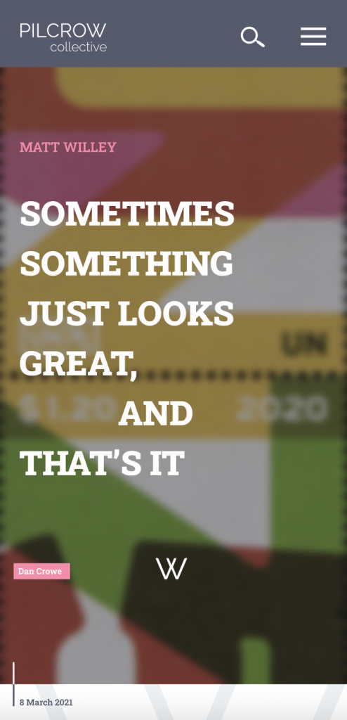
The mobile version utilises a 4 column grid and is made up of the same colour palette, with a pink menu. It also has many of the same features for easy navigation through large content such as articles, etc. Webpages also include tags and shortcuts to help the user search specific content.
